

Designing a successful checkout process
By Michael Macneil on Friday, 1 September 2017
There is nothing more annoying than looking at the analytics of your site to discover upwards of 65% of people that get to the checkout stage of your site ‘drop out’. Whilst you need to accept that there will be a percentage of people that will always drop out during the checkout process, your primary aim must to be minimise this number. In this post, we will discuss what you should and shouldn’t do in order to ensure visitors who make it to your checkout page actually complete the transaction.Keep the number of fields the user has to fill to a minimum. Whilst anyone wanting to make a purchase will need to fill in a certain amount of information, remove any fields that are not critical.
Tips: If you need to collect additional marketing information do this once the purchase has been completed. Use a postcode lookup service to automatically fill out some of the address fields. Make sure you allow the user to override these results as they can sometimes be inaccurate. Allow the user to duplicate shipping and billing information with a tick box, saving them the hassle of having to enter this information twice. A good way to save on form-filling is to offer PayPal as a payment method. Apart from being the world’s most used payment processing company, users with a PayPal account can automatically provide address information without having to type it in.
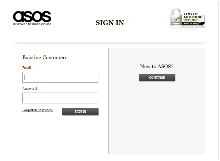
Do not require the user to register in order to checkout. This reiterates point one: keep the registration process as short as possible. Existing users should be able to log in and have their information pre-filled. New users should automatically be taken through the checkout process as a guest. In a well-published article ASOS managed to halve its ‘drop out’ rate on the registration page by removing any mention of creating an account.
Tips: Ask users if they would like to optionally create an account once they have completed the purchase. Explain the benefits associated with having an account and make the process as simple as possible. A simple statement like ‘Would you like to save your details for next time?’ should suffice. As you have most of their information already by this stage it could be as simple as asking for a password. Make sure you explain the benefits of creating an account so that the customer can see the value in providing these additional details.
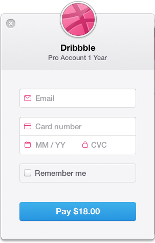
One page or three-stage checkout process? Up until recently, a single-page checkout process was widely considered to be the optimal format. Recent developments and advancements in analytics and A/B testing suggest that a multi-step process could achieve greater success. If you have a look at some of the largest eCommerce sites on the Internet you will struggle to find a single-page checkout. We’ve previously discussed the need to keep the amount of requested information down to a minimum. Once this has been achieved if you think logically there is no difference in data entry between a single and multi-page requesting this information. So it now comes down to an issue of usability. One-page checkouts are usually quicker to complete as there is no wait when moving from one step to another. They generally work well with lower cost and impulse purchases. The user can quickly enter their information, provide billing information and press checkout in one hit. It gives them less opportunity to reconsider their purchase and drop out. One-page checkouts can easily become cluttered and overwhelming if not laid out logically. This issue is often compounded when ordering from a mobile device. A great example of a well laid out one-page checkout can be seen at Bellroy. They seem to have blended the best of both popular checkout types into one.
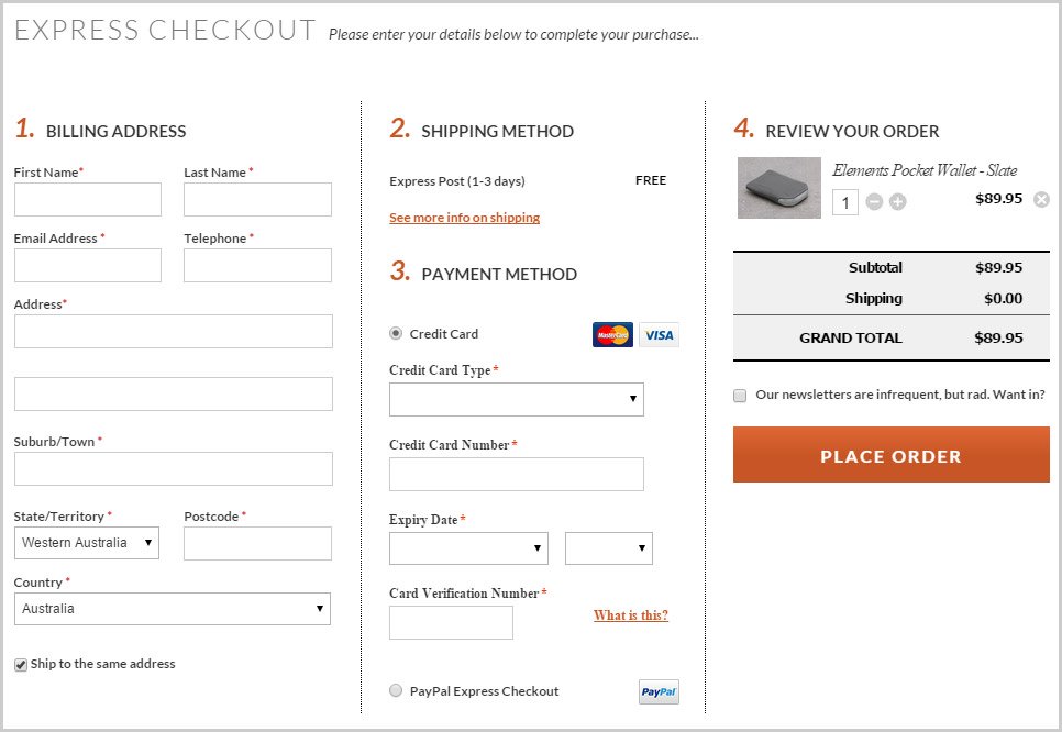
For larger value and more complex purchasing a three stage checkout would usually be more effective. It allows the user to review their information and feel safe and secure knowing everything is correct before submitting their purchase. Payment gateways are also starting to realise the importance of fast, efficient, user-friendly checkouts. Check out Stripe as a prime example.
One option would be to consider A/B testing using both solutions and see what produces the higher conversion rate. Check out Optimizely as one well-respected solution for effective A/B testing.
Tell the customer what to expect next. Once the purchase has been completed explain that they will shortly receive an email overview of the order. Explain the delivery process and provide contact information should they have any queries. Tips: Let purchasers know what company name will appear on their credit card statement. This will help minimise people ringing their banks and putting a freeze on payment because they do not know what the purchase was for.